Improve UX and Simplify Maintenance Tasks by Redesigning a Modular Platform
Spark Technologies previously developed multiple smart street lighting management platforms for various clients. However, inconsistent updates over the years resulted in design and user experience inconsistencies. To address this, Spark Technologies decided to create Sarea City, a modular smart street lighting management platform that can be customized to meet the specific needs of each client and easy to maintain.
Design Overview
In this project, I optimized the overall user experience, designed the entire platform from 0 to 1, and established a consistent design system for the platform to simplify maintenance tasks for the R&D team.
User Needs
According to the user stories from the project manager, the platform’s most important functions for street light maintenance staff were monitoring, editing, and controlling Internet of Things (IoT) devices.
How might we design an intuitive scheduling system that accommodates the diverse needs of various use cases?
Company Needs
Spark Technologies needed a new design system for Sarea City, their smart street lighting management platform, and an upcoming product series. The aim was to ensure consistency across diverse products for streamlined maintenance by the R&D team while maintaining flexibility for future applications.
How might we build a design system that ensures consistency and scalability across current and future products?
Challenge 01
How might we display IoT device statuses on a map clearly and informatively?
Problem:
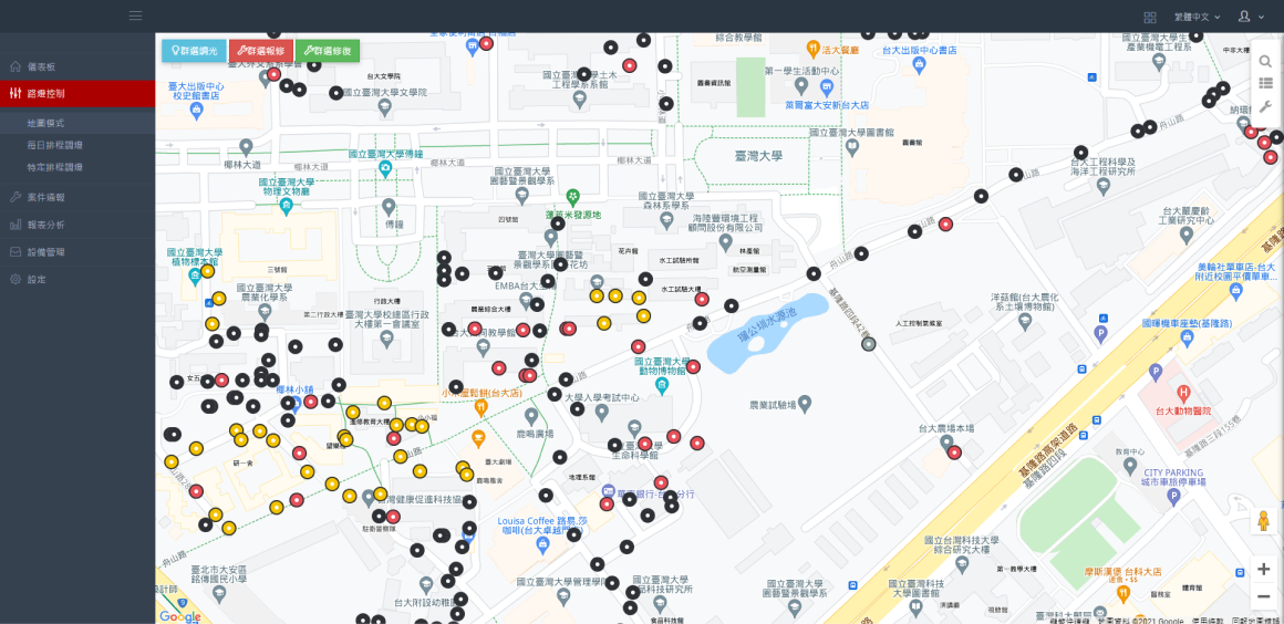
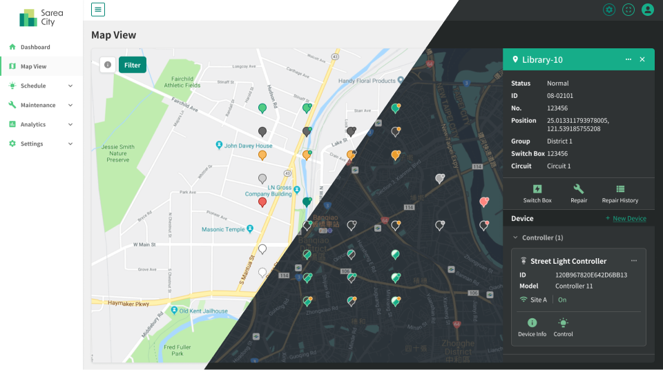
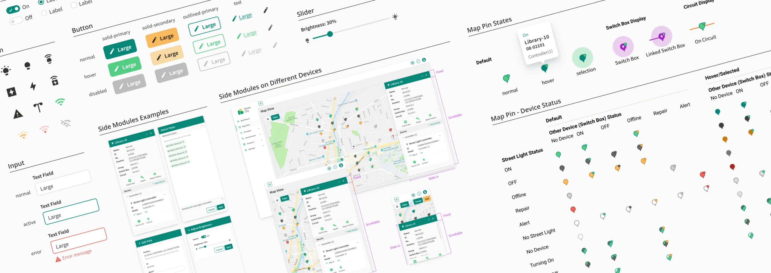
The Old Map Pins are Hard to Identify
In the existing platform, we used different colors on rings and circles to define the different statuses of each smart pole. However, as the number of installed IoT devices increased, the combination of colors on the map pins became too complicated and hard to identify.
Design Solution:
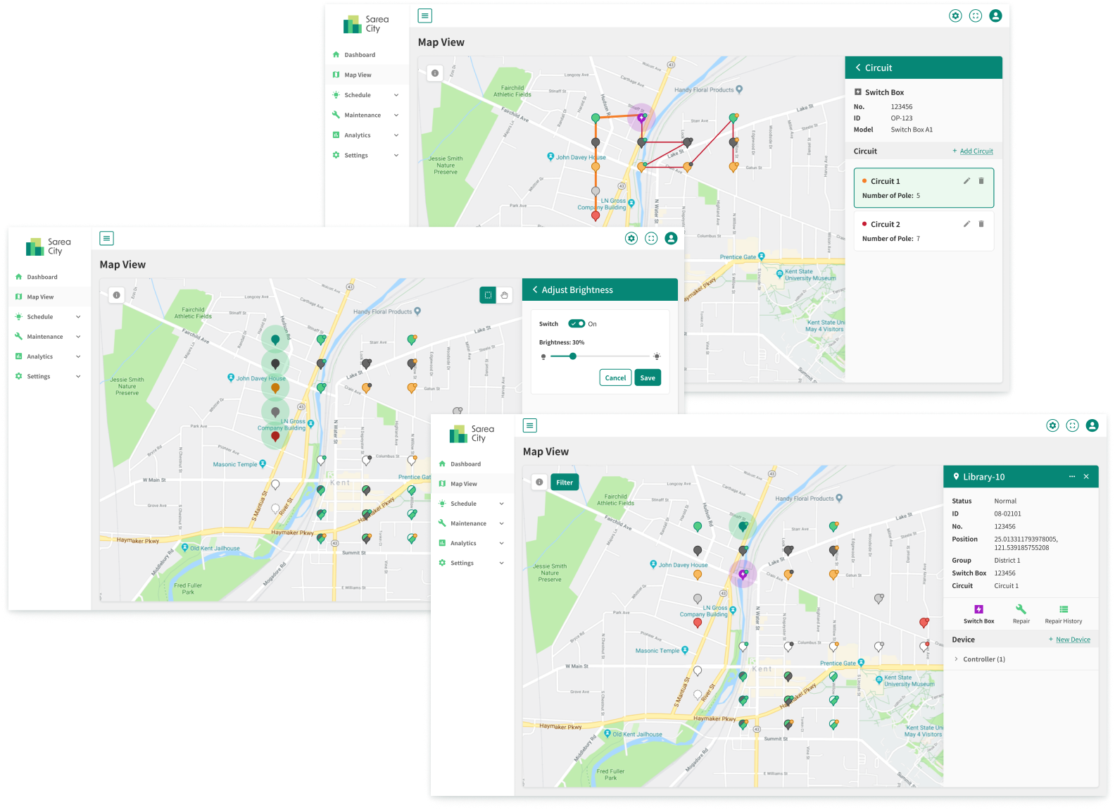
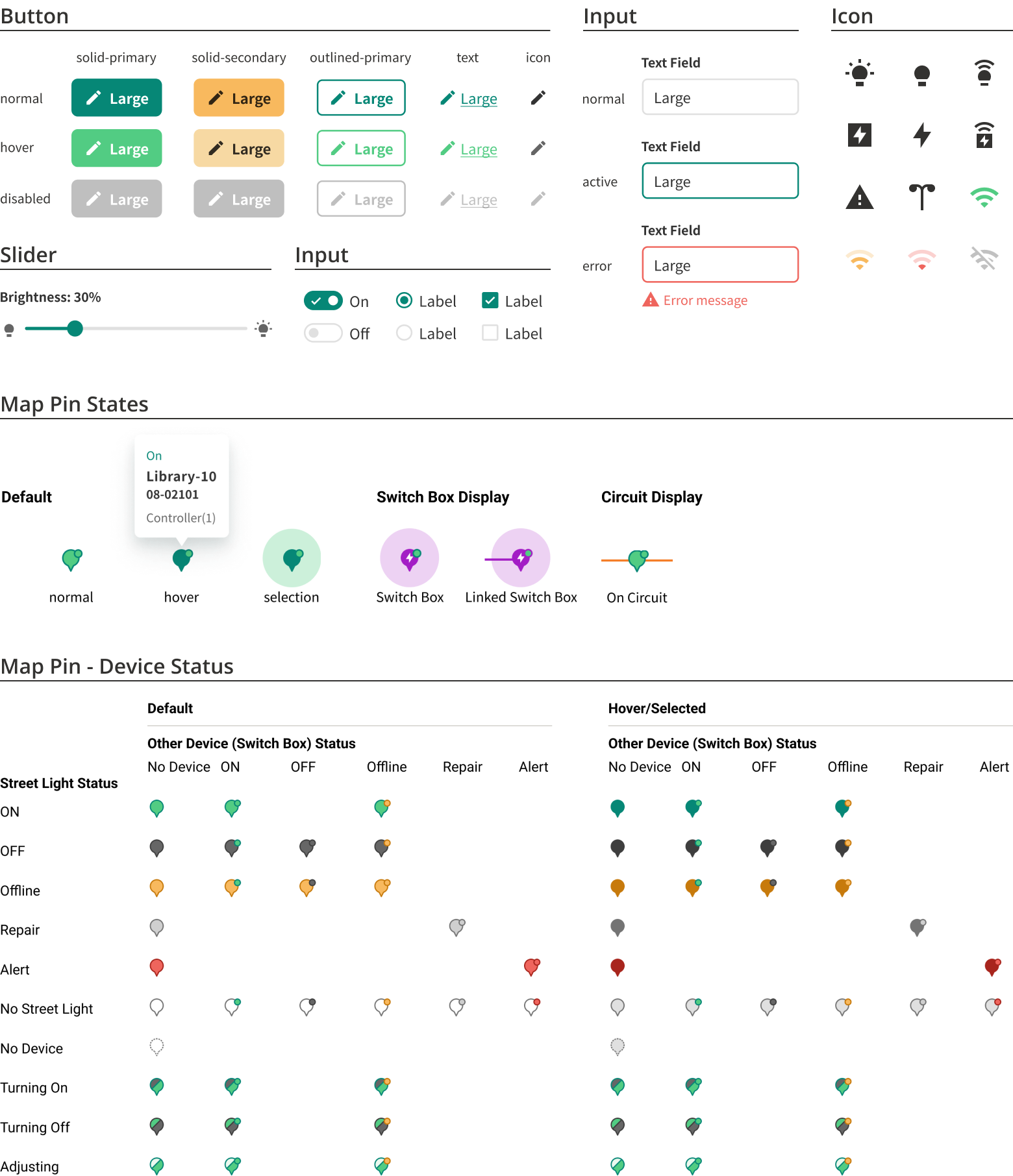
New Map Pin Design System
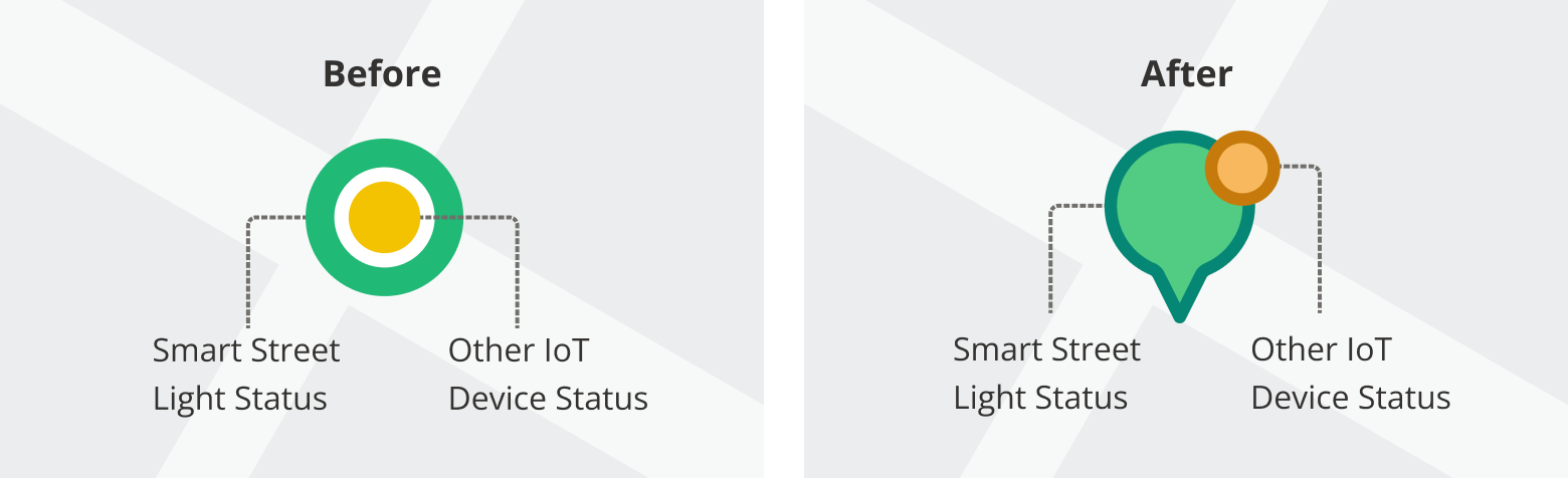
New Shape and Color
We replaced the original circular icon with a pin-shaped one to enhance user accuracy in identifying the specific location of streetlight poles through pinpointing. In addressing the needs of streetlight maintenance staff, we prioritized the luminaire controller statuses above other IoT devices, utilizing varied colors for map pins to represent different statuses of the luminaire controllers. For other IoT devices, such as electrical switch box controllers, their statuses are indicated by a small dot positioned in the top-right corner of the respective icons.
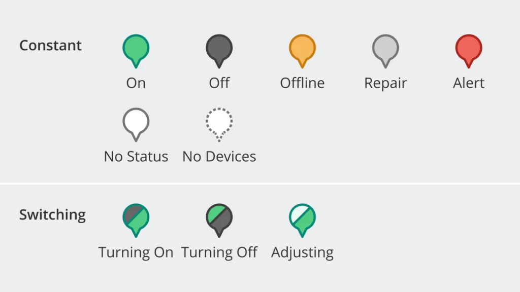
Status: “Constant” and “Switching”
We incorporated five distinct colors to indicate the status of devices on the pole: on, off, offline, alert, or under repair. If there are no devices on the pole, the pin remains white.
Notably, there’s a brief delay between users controlling the lights through the platform and the luminaire controller receiving the signal to adjust the light. This delay might lead users to believe they haven’t successfully controlled the lights, prompting unnecessary repeated commands.
To resolve this issue, we introduced a unique “switching” status that appears during the time gap after users control the lights through the platform. To convey this status more clearly, I combined the colors representing “on” and “off” to indicate the “switching” status better.
Challenge 02
How might we enable users to access detailed information for each smart pole and IoT device efficiently?
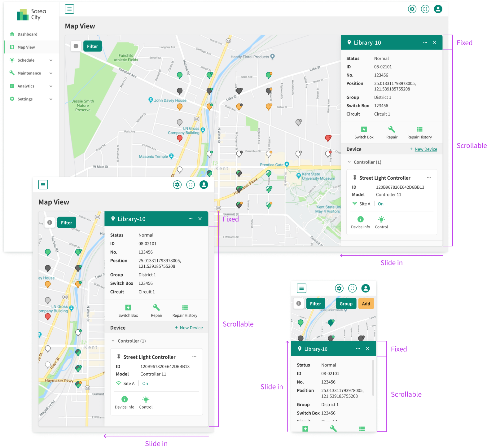
Problem:
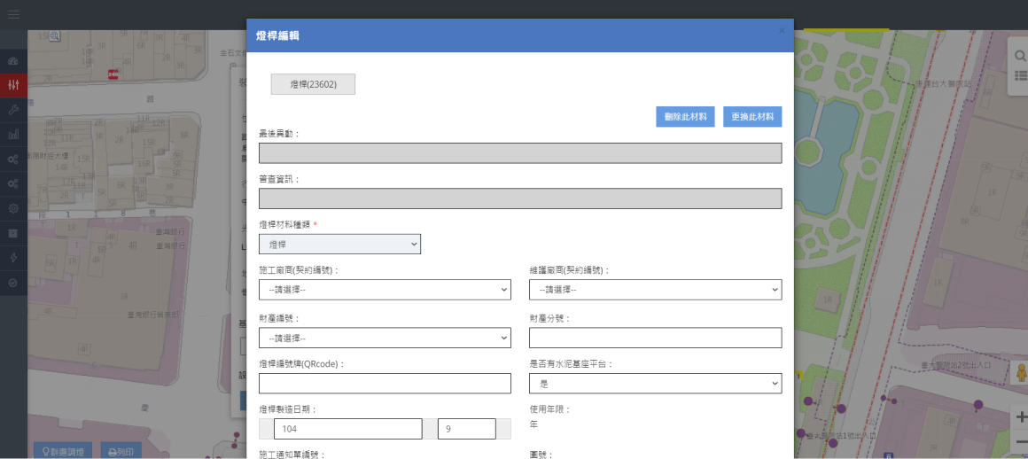
Space-Consuming Information Modules
While editing data, the pop-up window covers the map so that users cannot see the pins.
Design Solution:
Optimized Layout that Provides Flexibility in Information Display
Responsive Layout
The new information module is fixed on one side of the map so that users can edit the pole’s information and check the map pins simultaneously.
Flexible Information Display
When the information module is fixed on one side, it provides more flexibility of displaying more location-related information on the map.
Challenge 03
How might we design an intuitive scheduling system that accommodates the diverse needs of various use cases?
Problem:
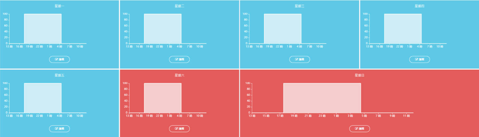
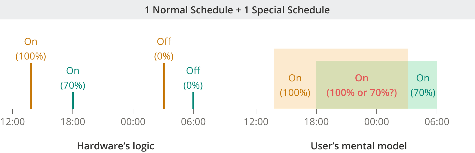
The Display of Schedules in the Old Platform Doesn’t Align with Hardware Operations
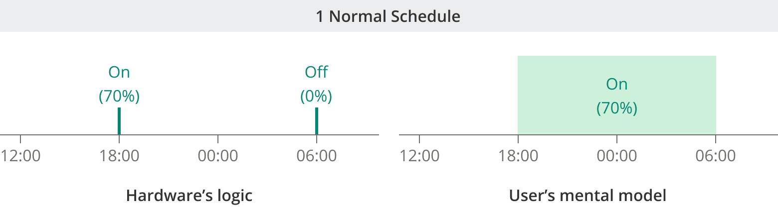
In the existing platform, the lighting schedule was displayed as a box, enhancing the user’s mental model of “scheduling” as setting a time slot. This differs from how the luminaire controllers actually operate.
For the hardware, the “schedule” is just a series of commands for specific times (ex. turn on at 6pm, turn off at 6am). However, because of the box-like display in the existing platform, users usually see schedule as a period of time (ex. the light is on from 6pm to 6am).
Since we aimed to apply multiple special scheduling to luminaire controllers to increase flexibility in lighting control, the existing display (box model) might cause confusion for users.
Design Solution:
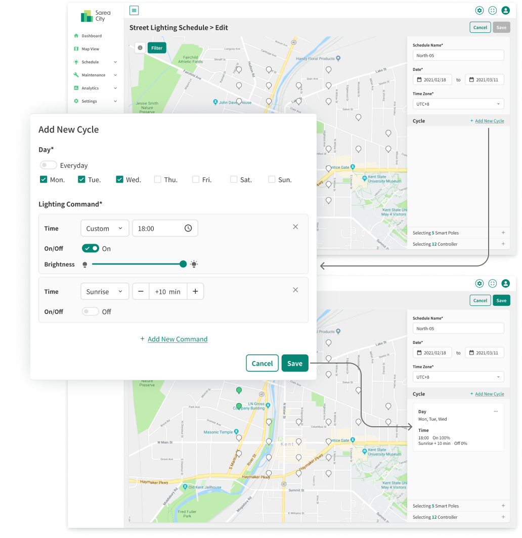
Cross-Device Multi-selection Process
We changed the user flow of scheduling from setting the brightness for a time slot to setting it for specific times. This way, users can clearly understand how the street light will behave.
Challenge 04
How might we build a design system that ensures consistency and scalability across current and future products?
Design Strategy:
Simplicity for Versatility
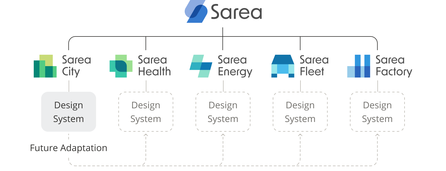
Sarea City was the first product of Sarea, the product series that contained Spark Technologies’ IoT management platforms for different vertical domains, including city infrastructure, healthcare, energy management, etc. Anticipating the need for a consistent design system across future products, I built the new design system with a flat and simple design style. This not only matched the logos but also ensured flexibility for upcoming adaptations, streamlining maintenance for the R&D team and providing clear instructions for future updates.
Design Solution:
Consistent Design System that Applies to Various Purposes
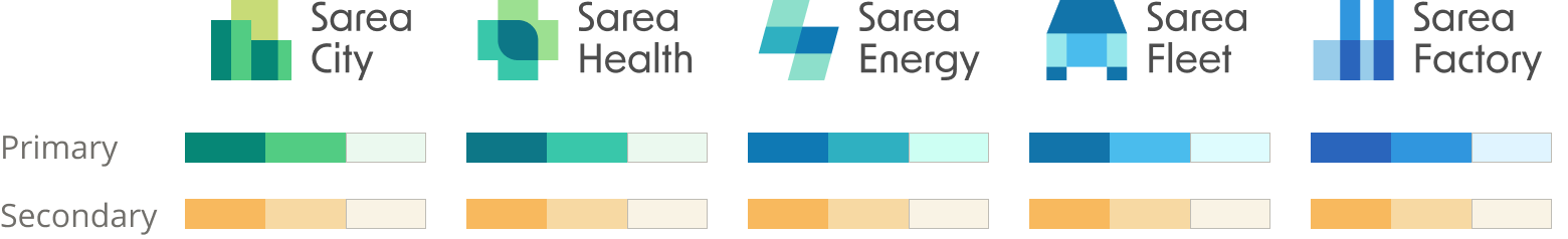
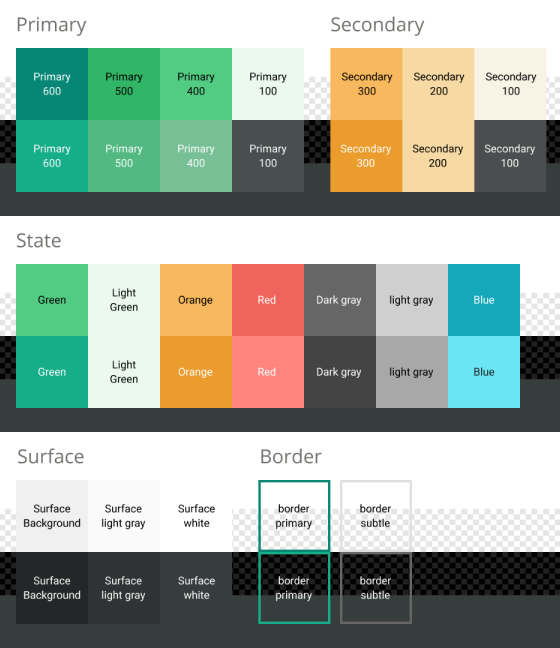
Color Scheme
I used grass green as the primary color to match the logo. For the secondary color, I chose light yellowish orange, which not only created a visual hierarchy through varying color brightness but also provided sufficient contrast with the primary colors of most other products. This strategic selection simplifies the application of the design system to other IoT platforms, reducing the effort required to keep consistency across products.
Dark Mode
While dark mode wasn’t a primary focus for this project, we ensured the design aligns with the overall product series’ standards by creating a dark mode color palette that directly references the default palette. Adjustments were made to saturation and color contrast to optimize readability and maintain clear differentiation between elements.
UI Components in Different States
In Sarea City, UI components come in various states, from basic elements like buttons and input fields to specialized ones like map pins. To help frontend developers understand and use these components in different scenarios more efficiently, I created an exhaustive list of all their possible states and statuses.
Impact:
Simplify Development and Maintenance Tasks for Customized Services
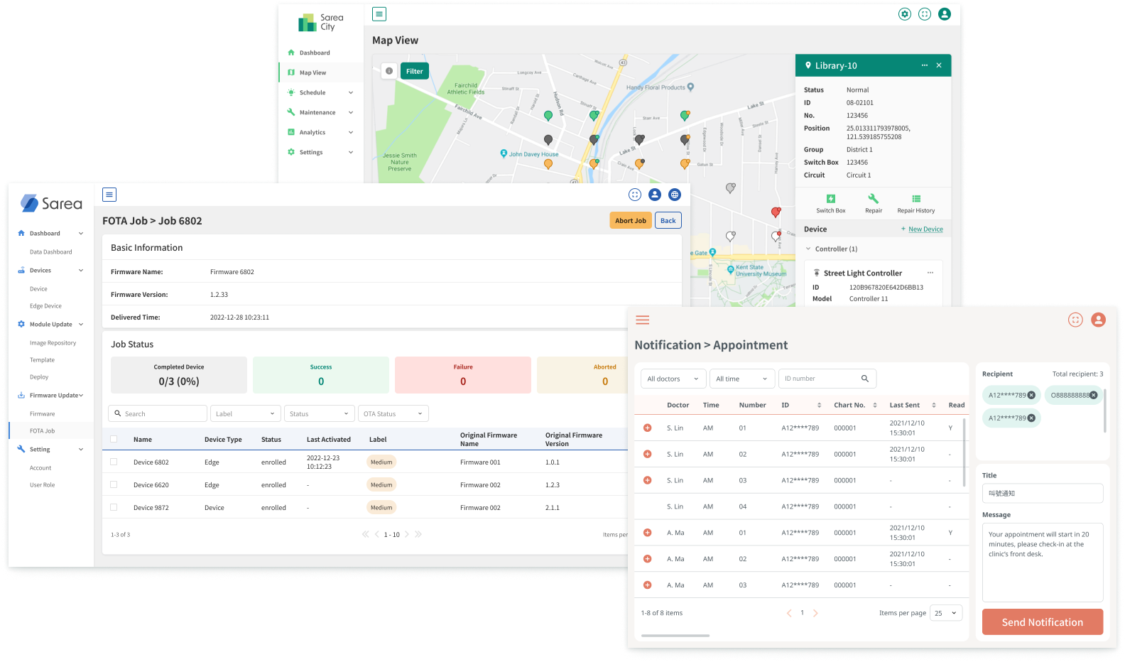
The UX design patterns and design system I created for this project were extensively applied across multiple custom IoT service projects. The design system and Figma component library significantly streamlined the design and frontend development processes in the following projects, enhancing overall product development efficiency.